A Custom Storefront Shopify Couldn't Render: Universal Language, Headless on Framer
How an apparel brand got a fully custom front end and kept a real commerce backend, with 92% of revenue running through the design instead of around it.
Framer + Shopify

At a glance
Client: Universal Language (apparel), through AlwaysCreative
Stack: Shopify backend, Framer frontend, Frameship as the sync layer
My role: Frontend build, Shopify setup, launch support, ongoing maintenance
Live: speakul.com
The challenge
The brief came with a finished Figma design, an apparel catalog, and one hard rule: a real commerce backend with no design compromise. The original ask was to build it as a Shopify theme.
I started down that road and hit the usual wall. Shopify themes are built in Liquid, Shopify's templating language, and Liquid only ever gets you close to a custom design. You spend weeks approximating layouts that Framer renders natively in minutes. Up until this point I'd treated Shopify as the whole stack. The reframe was to stop fighting it: let each tool do the one thing it's good at.
So I pitched a split. Framer for the frontend, where the design actually lives. Shopify for the commerce engine: inventory, checkout, payments. Frameship, a connector that mirrors Shopify product data into Framer's CMS, as the bridge between them. Roby Fitzhenry, AlwaysCreative's founder and the agency lead on the account, signed off and we rebuilt the front end in Framer.
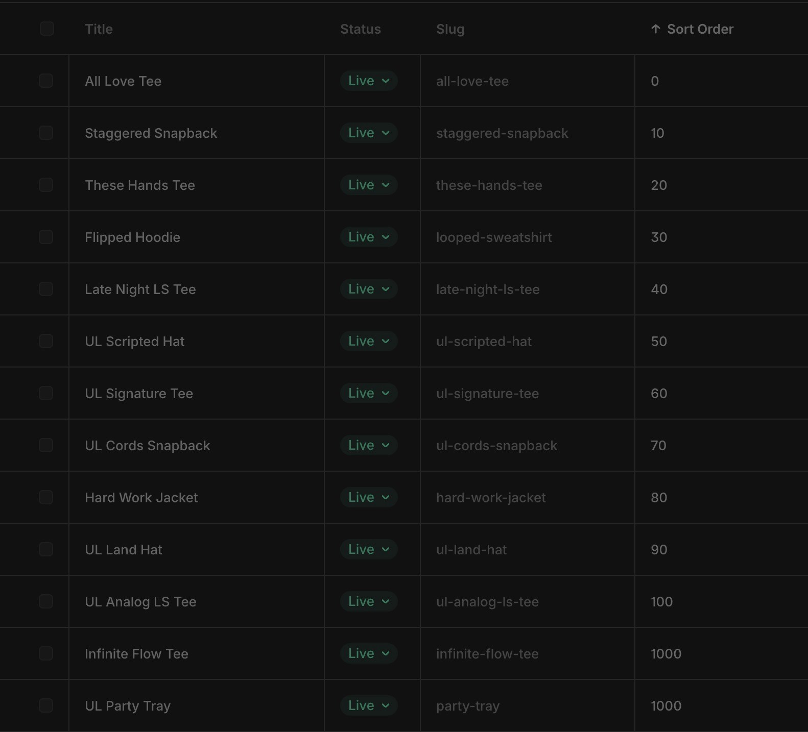
That solved the design problem and exposed a smaller one underneath it. Shopify's API doesn't expose the manual product order set in the admin, so when the client dragged products into a new order in Shopify, the site ignored it. I added a numerical Sort Order field to the Framer CMS and sorted the grid low to high. Assign a number, lowest sits on top. The client gets the drag-and-drop mental model they expected, just in a different panel.
The build
A few decisions that shaped the front end:
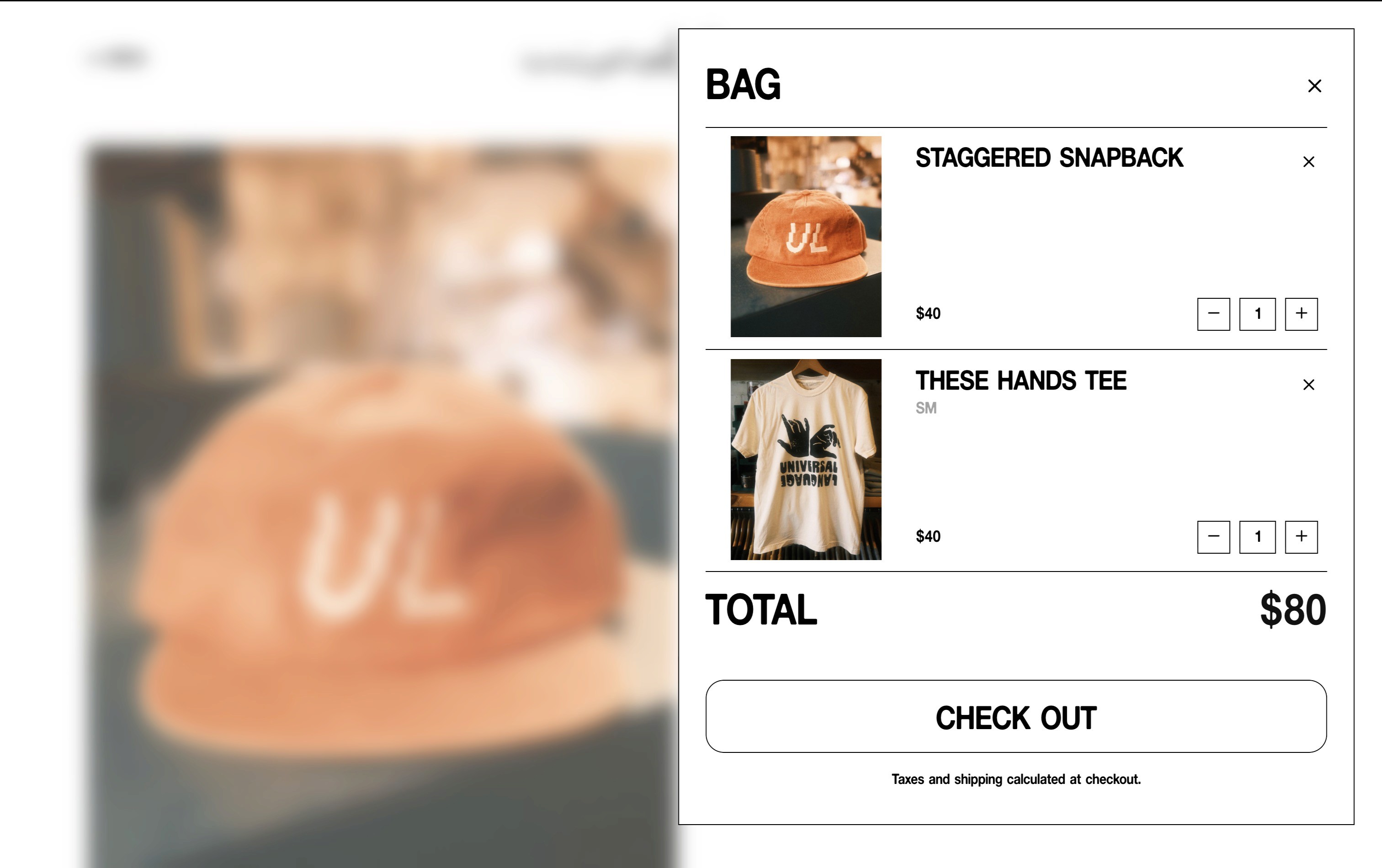
Mobile-first slide-out nav and a cart that opens as an overlay, since roughly 84% of storefront traffic came in on mobile (1.4K mobile sessions against 277 desktop)
Lazy-loaded product grid: 9 items on first paint, the rest load as you scroll (faster first render on a catalog that grew past 15 products)
Lightbox and a size-guide overlay on every product page
Image-swap rollover instead of a zoom. The original design called for a zoom on hover. I argued for a straight image swap because it matches how people actually scan a catalog, and Roby agreed
A fallback gray block behind transparent product PNGs, so a missing or slow image never breaks the grid layout
The motion language
Because most of the audience was on a phone, I built every secondary action as an overlay rather than a page route. The nav, the cart, the lightbox, and the size guide all slide over the current view instead of loading a new page. The storefront never blanks out between actions, so browsing a product, checking sizing, and adding to cart all happen without the screen ever going white.
It's a small decision that does a lot of work on mobile. Page transitions on a phone read as friction. Keeping the user on one continuous surface makes a small catalog feel like a considered shopping experience instead of a series of loads.
Launch day
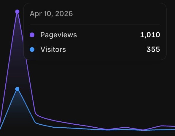
The brand owner announced the launch on Instagram. The site went from a near-zero baseline to 1,010 pageviews and 355 visitors in a single day.
And then the bug. As the first wave of traffic hit, every product started showing as SOLD OUT in the cart. Roby pinged me in a panic. We jumped on a Zoom, traced it to a Shopify location that had no inventory attached, and patched it while customers were still on the site. Not the launch I'd planned, but the kind that proves the stack holds under real load.
Results
First quarter of trading (April–June 2026):
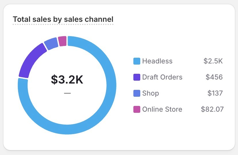
97% of storefront revenue ran through the headless front end ($2.5K, against $82 through Shopify's default theme; manual draft orders excluded)
$4,007 gross sales across 47 orders, $66.64 average order value
13.21% conversion rate, 9.75% returning customer rate
2m44s average session, 56.1% bounce, 1.7K unique visitors and 4.3K pageviews over 90 days
Instagram and direct drove most attributed sales, on an ~84% mobile audience (1.4K mobile against 277 desktop)
What changed
Headless on Framer plus Frameship is now my default pitch for any design-led Shopify brief. I learned both stacks end to end on this build, which is exactly why it's the version I'm most confident recommending. The split costs you a sync step the client has to remember, but when the design is custom enough to matter, it's the better trade nearly every time.
"Hannes is a great person to work with. His quality is fantastic, very organized, and so much better than most in his industry. Excited to continue working with him in the future."
— Roby Fitzhenry, Founder/CCO, AlwaysCreative