Framer Development for Fortify Education
Framer Development, Animation
Overview
Fortify Education helps schools and universities collect more tuition by giving students accessible financing options. As the company refined its positioning, their old website no longer reflected who they were. The previous site was generic, corporate, and lacked the clarity and polish needed for a product that handles something as sensitive as tuition financing.
They hired me to rebuild their new Figma design inside Framer and deliver a smooth, credible web experience that matched their updated brand direction.
The Challenge
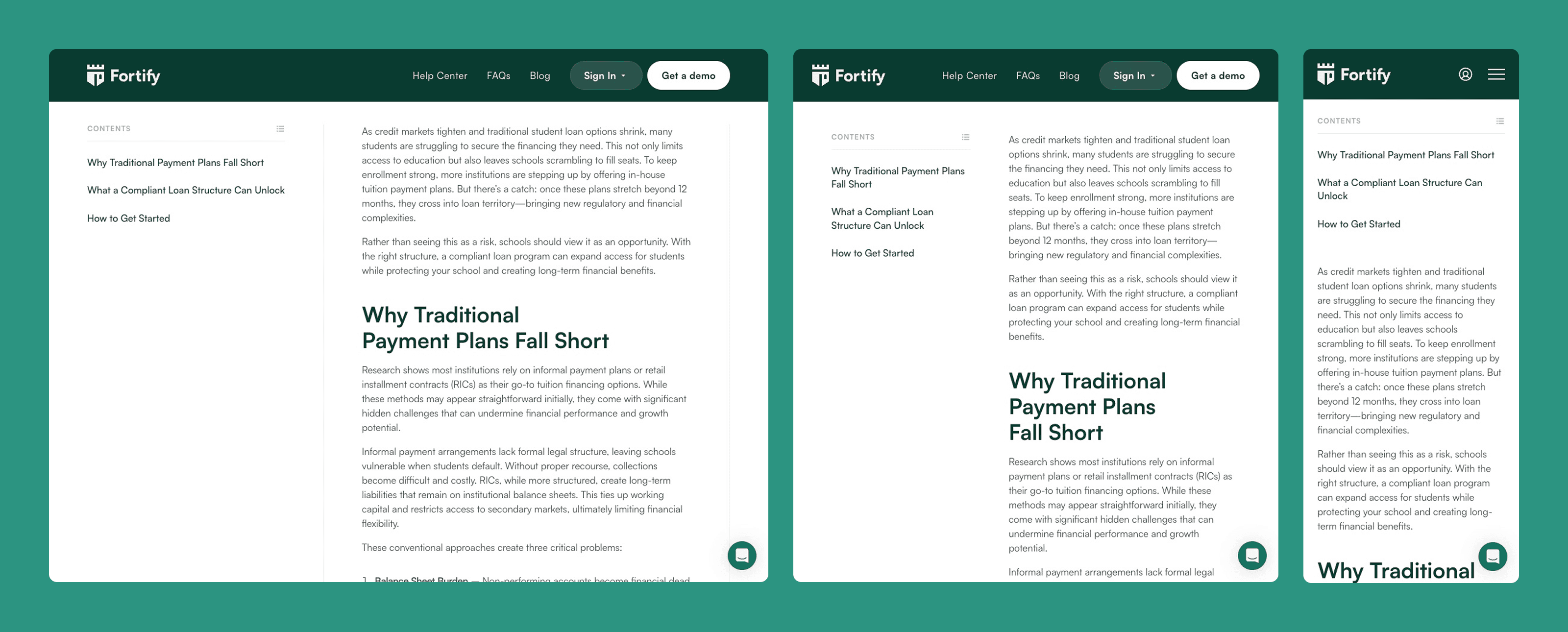
Although the design was mostly complete, it didn’t fully account for how the site should behave across different screen sizes when the build started. There was no dedicated tablet layout, mobile assets needed reworking, and the Figma file received updates throughout development. At the same time, the expectations for precision were high. Small inconsistencies mattered, especially in the 810px–1200px range where most builders take shortcuts.
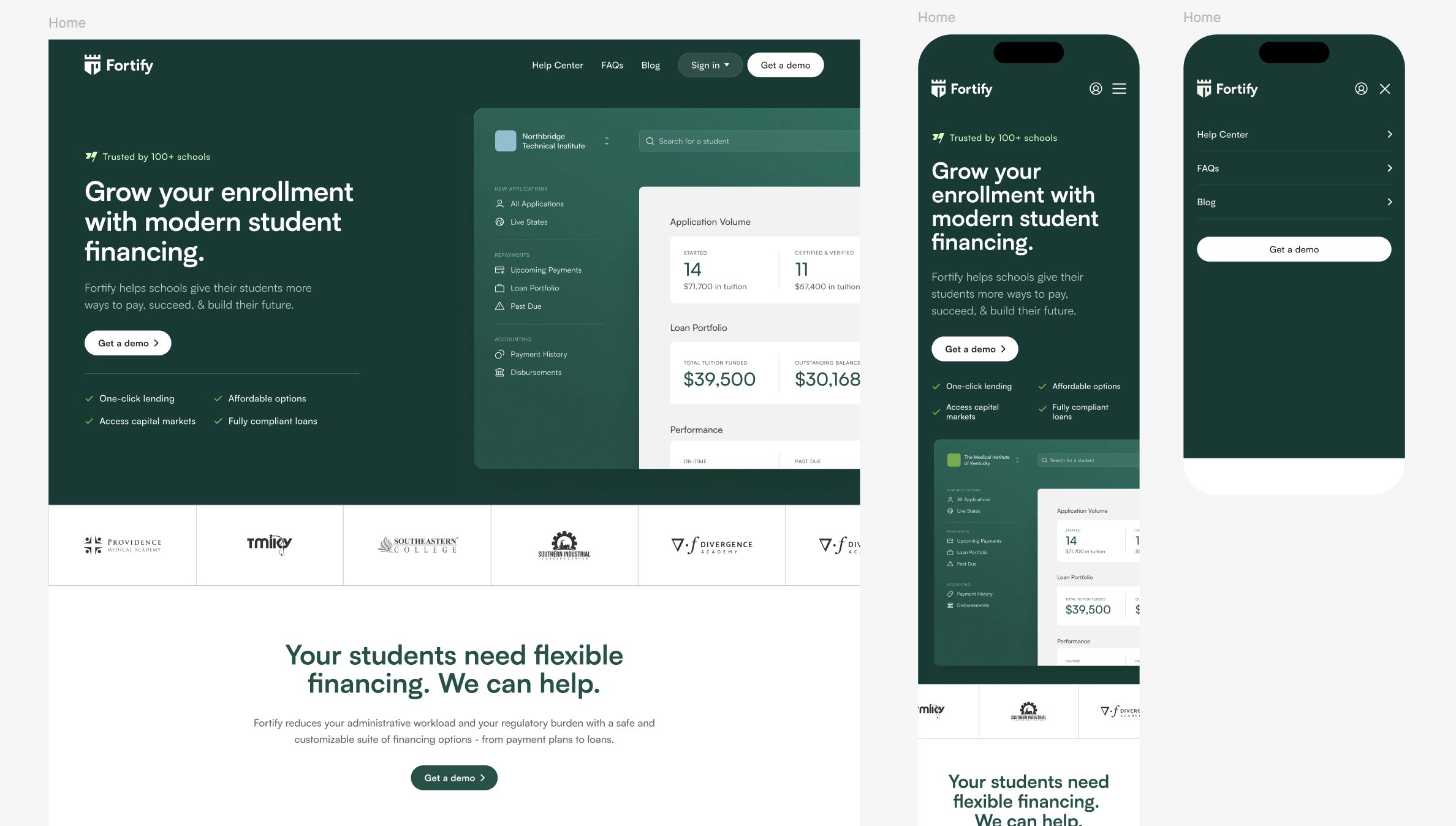
The task wasn’t just to “implement the design.” It was to interpret it, refine it, and make it feel intentional on every device.
My Role
This was a development-only project, but I handled it with a designer’s mindset. My responsibilities included:
Rebuilding the site in Framer with pixel-level accuracy
Developing a smooth, logical breakpoint system (desktop → tablet → mobile)
Creating page transitions and button animations that elevated the brand feel
Structuring the CMS for the blog and legal pages
Implementing the sign-in modal, mobile navigation, and interactive components
Custom-developing the testimonial slider
Setting up Formspark integration for demo requests
Adapting the design where the Figma was incomplete or impractical
The Solution
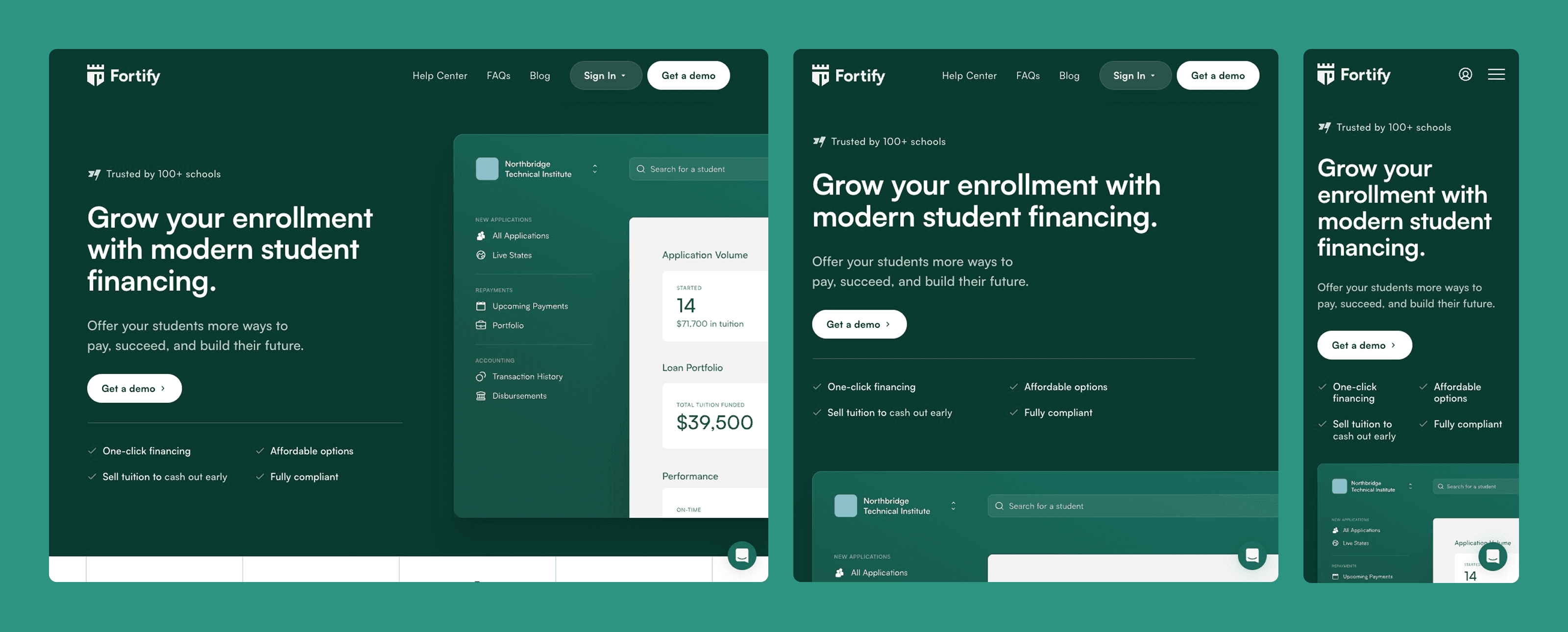
Breakpoint Architecture
Because tablet designs were missing, I rebuilt the layout from scratch at the 850px range and made careful decisions on spacing, image scaling, and content alignment. The result was a site that didn’t “jump” between breakpoints but transitioned fluidly, something the founder explicitly valued.
Motion & Interaction
Fortify’s brand needed to feel trustworthy, but not cold.
The animation style reflects that:
A soft accent-color glow on interactive elements
A clean wipe transition on primary buttons
Polished page transitions across the entire site
These touches brought warmth and clarity without making the experience feel playful or casual.
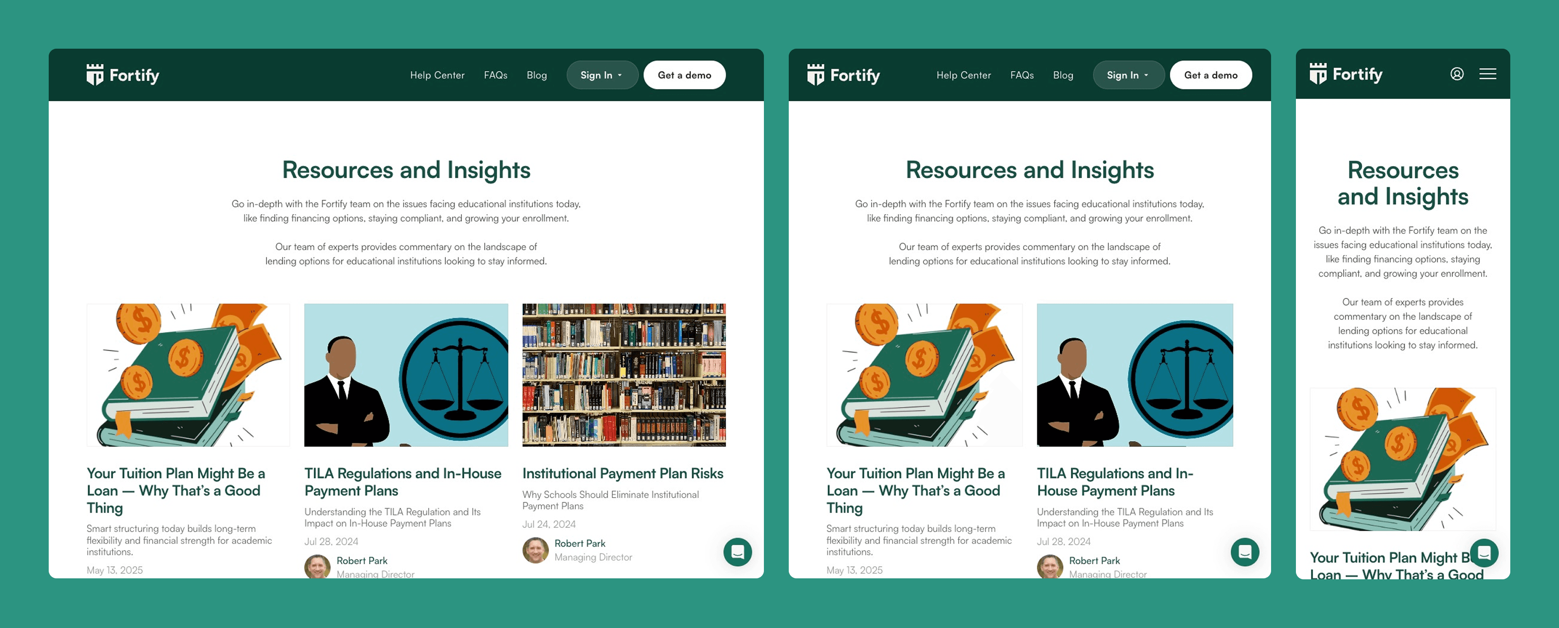
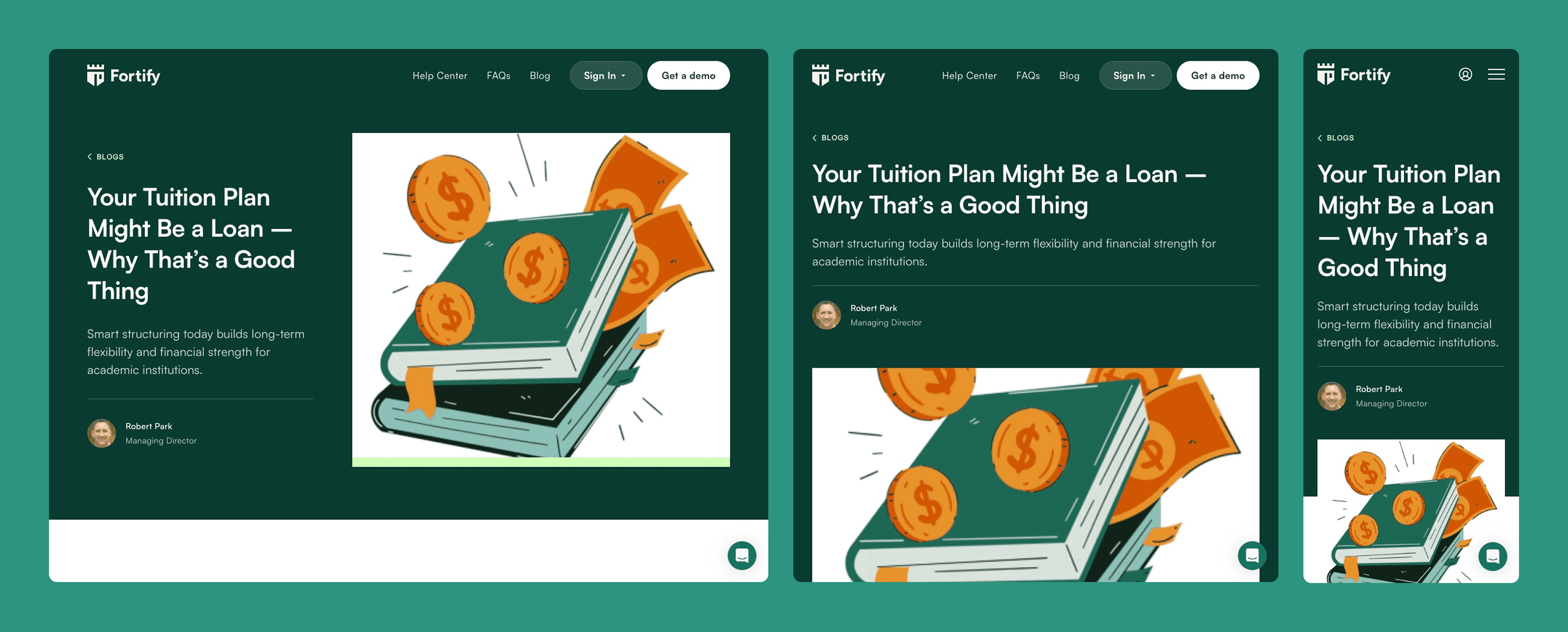
CMS for Long-Term Flexibility
I implemented a blog CMS, complete with rich-text formatting and reusable templates. Framer doesn’t support a native table of contents for CMS pages, so I looked for a Marketplace component to integrate a proper TOC that matched the intended structure. It was a small detail, but it made the article experience significantly better.
I also built a CMS-driven system for legal pages, making it easier for the Fortify team to update compliance requirements without touching the layout.
Key Improvements
A modern, clean, trustworthy interface that reflects Fortify’s updated brand
Smooth breakpoint handling, especially at the tricky mid-ranges
Fast, responsive navigation with a fully functional mobile menu
A more engaging hero section with animated brand logos
A more intuitive blog reading experience
Consistent component behavior across pages and devices
Results
The final site looked and felt significantly stronger than their previous version. It aligned with their messaging, improved their credibility, and gave the brand a professional foundation for sales conversations. In fact, the homepage was launched early because, in the founder’s own words, it was already “way better than the old one.”
Reflection
This project sharpened my instincts as a developer working with handed-off designs. I didn’t control the visual direction, but I still needed to make judgment calls every day, especially when bridging missing breakpoints or resolving design inconsistencies.
It also highlighted the importance of clear tooling. Email made feedback slow and fragmented, which reinforced how much smoother projects run when communication is optimized.
Overall, this project strengthened my Framer workflow and expanded my understanding of how to translate static designs into a fully responsive, production-ready site.
Tools
Figma, Framer + CMS, ChatGPT
